High-Speed Gardening (feat. Wil Williams)
SUPPORT: To hear the other half of this interview, and get us closer to our goal of 100 patrons, visit our Patreon and pledge $1 today!
Wil Williams shares with us a description of Ed Ruscha's High-Speed Gardening, the joy that they find in Ruscha's work, and a bit about what it means to them.
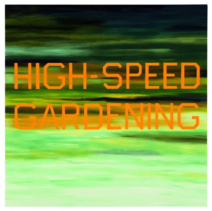
High-Speed Gardening, Ed Ruscha, 1989
Notes
The Guest:
Wil Williams is a podcaster and 1/3 of Hug House Productions, who make Valence, a new audio drama written and directed by Wil, and Scoring Magic, a documentary about the making of Valence.
The Art:
This episode discusses Ed Rusha’s High-Speed Gardening (1989), which we saw at the Phoenix Art Museum in the Modern Art Wing.
Support:
Credits:
This episode features music by Blue Dot Sessions. Our season two art was made by the incomparable V Silverman. This episode was edited by T.H. Ponders, and produced by T.H. Ponders and Ana O’Daniel. Our executive producers for this season are Charles Gustine and James Oliva.
The Show
The way that I experienced this, I did not know that it was in the museum when we were there. And I turned around and I was hit by a wall of green. Just green was the first thing I experienced. But then as my eyes focused on it a little bit more, from the top of the painting down, we have a gradient of dark kind of forest mossy greens with some black and darker tones. And as it goes down there is sort of one final dark streak before it blends with a sort of pumpkiny orange, and then blending down further, it goes to a neon green and then kind of like a minty nice, almost key lime green at the bottom. And when I say blended and a gradient, I don't want it to seem like it is smooth. It's not smooth. There are little sort of jagged areas where the edges are blurred but it juts out into the middle of the painting from each side as it kind of goes from the darker to the lighter where they'll be an odd smudge of a darker green or you know, kind of that great black. And then with that pumpkiny orange in the middle there is painted in very, very, very clean lettering, sans serif, but with sort of squared corners, “High-Speed Gardening”, hyphen in the middle of high and speed. Gardening, especially the middle of the letter’s G and A, blend into the pumpkiny orange which is blended into the greens in the background. So the G and the A are a little bit harder to make out than the rest of the letters. But otherwise it's a great contrast with the letters and the rest of the green in the background.
High-Speed Gardening, Ed Ruscha, 1989
I have read a lot about Ed Ruscha and a lot from Ed Ruscha, and he is part of this movement that, and I don't know anything about art or art history, but I know that there was a movement in which people made sort of strange, not quite pop art, not quite abstract, not quite really anything else. And while there is a lot of feeling there, the artists shy away a lot from being prescriptivists about it. So Ed Ruscha, one of his his trademarks is that he'll use very strange phrases that just kind of pop into his mind. He'll use those on paintings, less so to be something specific or explicit and more because the words sounded correct to him. And he feels like, you know, from what he has said, the point is for you to feel something or not and that is up to you.
Actual Size, Ed Ruscha, 1962.
Well, he's like so he's hilarious. A lot of his paintings are so funny. The first one I ever saw in person was a painting called Actual Size. And again, it's this huge canvas. And the painting is of the surface of the moon, and a can of Spam falling to the surface. And it's called Actual Size, because the can of Spam is the actual size of a can of Spam. And it's so funny. That’s such a surreal, bizarre thing to paint on this huge canvas. But he's, I love that weird humor. I love that idea of... I think with High-Speed Gardening like, and this is so obviously anachronistic and taking this out of the time it was made, but, you know, this idea of almost like gamifying and optimizing self care, you know, where there is like, you know, there's like checklist online for self care, and it's like, bath bomb, sugar scrub, make a hair mask, and you know, these sort of like quick things that you can check off to fix something that is less tangible than I think the internet wants it to be. And I think that that feels so hyperbolic and High-Speed Gardening in a way where, like, it's hilarious, but it's also gorgeous to look at. Like, it's the contrasts is wild. For a long time I didn't know how he did the lettering, because it's just so pristine. And then when I saw the first one in person like, “Oh, that's just painted, it's just pristinely painted like a flawless San Sarah font.” And yeah, I just I love. I love that he dedicates such a, like, traditionally respected art, these huge canvases, these like really specific choices in painting, to things that are like at the end of the day, really hilarious.


